
Embracing the Sophistication of Silhouette AF-655: Benjamin Moore’s 2026 Colour of the Year
- Evalina Schmidtke

- Jan 22
- 4 min read
Updated: Feb 19

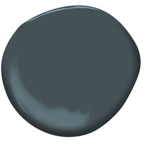
Photo: Courtesy of Benjamin Moore. Colour of the Year 2026 Silhoette AF-655
As an interior designer immersed in the world of color and texture, I’ve witnessed the profound impact that a single hue can have on our living spaces. Enter Silhouette AF-655 , Benjamin Moore’s Color of the Year for 2026. This choice marks a pivotal moment in interior design, heralding a shift towards grounded luxury, defined permanence, and emotional richness in our homes.
The Philosophy Behind Silhouette AF-655
The journey to selecting Silhouette AF-655 was not merely about color; it was about encapsulating a feeling, a vibe amidst the maelstrom of our overstimulated lives. As we grapple with the fleeting nature of trends, this “new neutral” imbues spaces with a sense of security and calm. Its deep espresso and refined charcoal qualities create a sophisticated canvas for life’s daily moments.
The inspiration draws heavily from “classic suiting,” reminiscent of a perfectly tailored blazer that combines both structure and comfort. This aligns with the burgeoning “Quiet Luxury” movement—a sophisticated, understated design philosophy that encourages confidence without ostentation.
Longevity over "Likes": Benjamin Moore intentionally chose a hue that transcends social media micro-trends, focusing on a color that homeowners can live with for years rather than one that serves as a temporary statement
In choosing Silhouette, Benjamin Moore responded to our intrinsic desire for personal sanctuaries—spaces that are, quite frankly, a “warm hug.” Soft, earthy tones paired with rich charcoal notes reflect our collective yearning for stability and warmth, shifting away from the starkness of pure black, reinforcing the idea that our surroundings should offer refuge.
If you are wondering what colours to pair with Benjamin Moore Silhouette AF-655 we suggest pairing it with a warm white such as Swiss Coffee OC-45 for a classic contrast. Use this soft white for built in shelves and moldings with painted walls in Silhouette-655.
Try a

Effects of Silhouette AF-655 on Room Moods
Delving deeper into its psychological effects, it’s fascinating how the application of Silhouette can transform a room:
Intimacy & Focus: In spaces like libraries or bedrooms, Silhouette creates a cocoon effect, promoting introspection and restful sleep. Nestling beneath its enveloping tones, one finds a tranquil escape from the bustling outside world.
Authority & Confidence: The color's charcoal undertones radiate power and professionalism, making it the go-to choice for home offices or formal dining areas, enhancing their sophistication.
Warmth & Comfort: The rich espresso base stimulates an inviting ambiance that transcends the sometimes harsh energy of darker colors. Expect warm and earthy vibes, perfect for gathering spaces.
Pros and Cons of Silhouette AF-655
No design choice comes without its pros and cons, and understanding these will help in utilizing Silhouette AF-655 effectively:
Pros:
1. Architectural Definition: This shade draws the attention to details, making features like crown molding and built-ins appear intentional—almost luxuriously curated.
2. Versatile Layering: With a Low Light Reflectance Value (LRV) of 10.18, Silhouette serves as the perfect backdrop. It allows metallic accents and lighter wood tones to truly shine, creating a beautiful contrast.
3. Spatial Perception: Contrary to conventional wisdom, utilizing “color drenching”—a holistic application of this shade on walls, trim, and ceilings—can give the illusion of greater space, blurring harsh lines and enveloping the room in elegant continuity.
Cons:
1. Lighting Sensitivity: One crucial consideration is lighting. In poorly lit rooms, or without layered lighting solutions, Silhouette can seem flat or shadowy, detracting from the depth and richness we desire.
2. Aggressive Contrast: If splashed solely on one wall against stark white, it risks creating jarring visual disruption. Instead, a cohesive application will yield far more pleasing results.
3. Dust & Marks: As is the case with darker, matte finishes, expect fingerprints and dust to be more noticeable. A bit of commitment to upkeep is essential for maintaining its beautiful allure.
TIP
Here are some complimentary colours that work with Silhouette AF-655.
For Modern Farmhouse themes that are still going strong, try using Raindrop and Narrangansett Greens for built in shelving such as a mud room.

For intimate spaces like a powder room, colour drenching the walls and ceilings with Silhouette with textural moldings on the walls, Try a satin finish for the ceiling for contrast and don't forget about mood lighting like sconces or back-lit mirrors.
Dark spaces although warm in tone, require ambient lighting to bring out the warmth and depth of the colour.


Benjamin Moore’s choice of Silhouette AF-655 reflects more than just a color; it encapsulates the mood of an era. It invites us to step away from the transient nature of fleeting digital aesthetics and immerse ourselves in the luxurious permanence of thoughtful design. Embrace this versatile hue, allowing it to transform your spaces into lasting sanctuaries of personal expression and emotional resonance. Let us navigate this journey of color together and celebrate the lasting warmth that Silhouette offers to our homes.


Comments